The flex properties are used to control the sizing behavior of flex items. The flex-grow property controls the flex items ability to grow to fill the available space of the flex container. The flex-shrink property controls the flex items ability to shrink to fit the dimensions of the flex container if the items are overflowing. The flex-basis property controls the initial size of the flex item before any growth or shrinkage occurs. These can all be combined using the shorthand flex property. When the flex-direction is related to the row, the width of the items is affected. When the flex-direction is related to the column, the height of the items is affected. These properties will not override any max-width, min-width, max-height, or min-height properties if they have been set for the item. However, they will override any standard width or height properties if they have been set.
The flex-grow property controls the flex items ability to grow to fill the available space of the flex container. The default value is 0 which means the flex items do not grow by default. If the value is set to 1, the flex item will grow to fill the available space of the flex container. If the value is set to 2, the flex item will grow to fill twice the available space, etc. The number must always be positive. Decimals are also accepted. The sizing is proportional and the settings for all other flex items in the container are considered when the flex item with this setting grows.
Flex-Grow Formula
The size that the flex items will grow to fill the container can be determined by using all of the following calculations:
Flex-Grow Examples
Written Example
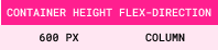
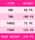
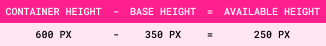
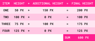
The height of the flex container is 600px.
It is set to flex-direction: column.
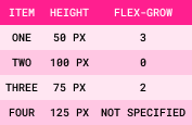
It contains the following four flex items:
Step 1: Base Size = Sum of All Item Sizes
Step 2: Available Space = Container Size - Base Size
Step 3: Grow Factors = Sum of All Flex-Grow Values
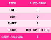
When the flex-grow value is not specified for an item, it defaults to 0.
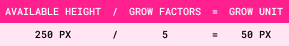
Step 4: Grow Unit = Available Space/Grow Factors
Step 5: Additional Size = Item Flex-Grow Value x Grow Unit
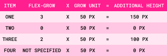
Step 6: Final Size = Item Size + Additional Size
Visual Examples
Here is a visual representation of the written example:
The container and items without flex-grow values:
Item One
original height: 50px
Item Two
original height: 100px
Item Three
original height: 75px
Item Four
original height: 125px
The container and items with flex-grow values:
Item One
flex-grow: 3
original height: 50px
final height: 200px
Item Two
flex-grow: 0
original height: 100px
final height: 100px
Item Three
flex-grow: 2
original height: 75px
final height: 175px
Item Four
flex-grow: 0
original height: 125px
final height: 125px
The following information will be valid for all examples:
- The flex container has a static width of 320px.
- All 3 flex items have a min width of 80px with no padding or margins, which means the minimum amount of space they will take up is 240px (80px x 3 = 240px).
- This means the available space for the flex items to grow into is 80px (320px - 240px = 80px).
Example 1: The flex-grow value is set to 1 for all flex items.
A
flex-grow: 1
width: 106.67px
B
flex-grow: 1
width: 106.67px
C
flex-grow: 1
width: 106.67px
Since the value is 1 for all items, they will all grow to fill the available space equally. This means each item will grow approximately 26.67px (80px / 3 = 26.67px). This gives each item a width of 106.67px (80px + 26.67px = 106.67px).
Example 2: The flex-grow value is set to 0 (default value) for items A and B, and 1 for item C.
A
flex-grow: 0
width: 80px
B
flex-grow: 0
width: 80px
C
flex-grow: 1
width: 160px
Since the value is 0 for items A and B, they will not grow. Item C will grow to fill all of the available space. This means it will grow approximately 80px. This makes the total width for item C 160px (80px + 80px = 160px).
Example 3: The flex-grow value is set to 0 (default value) for item A, 1 for item B, and 2 for item C.
A
flex-grow: 0
width: 80px
B
flex-grow: 1
width: 106.67px
C
flex-grow: 2
width: 133.33px
Since the value is 0 for item A, it will not grow. Item B has a value of 1, while item C has a value of 2. This means that item b will take up 1/3 of the available space, while item C will take up 2/3 of the available space. When the available space is divided by 3, the result is 26.67px (80px / 3 = 26.67px). This means item B will grow to 106.67px (80px + 26.67px = 106.67px) and item C will grow to 133.33px (80px + 26.67px + 26.67px = 133.33px).
The flex-shrink property controls the flex items ability to shrink to fit the flex container if the items are overflowing. The default value is 1 which means the flex items will shrink to fit the flex container if they are overflowing. If the value is set to 0, the flex item will not shrink. If the value is set to 2, the flex item will shrink twice the amount to fit the container, etc. The number must always be positive. Decimals are also accepted. The sizing is proportional and the settings for all other flex items in the container are considered when the flex item with this setting shrinks. Unlike the flex-grow property, the flex-shrink property requires a shrink percentage to be calculated when items are different sizes.
Flex-Shrink Formula
The size that the flex items will shrink to fit the container can be calculated in a similar way to the flex-grow formula when all flex items are the same size. However, when the flex items are different sizes, the formula is slightly more complex as shown in the following calculations:
Flex-Shrink Examples
Written Example
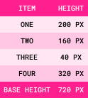
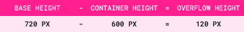
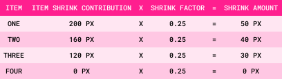
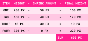
The height of the flex container is 600px.
It is set to flex-direction: column.
It contains the following four flex items:
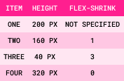
Step 1: Base Size = Sum of All Item Sizes
Step 2: Overflow Amount = Base Size - Container Size
Step 3: Item Shrink Contribution = Item Size x Item Flex-Shrink Value
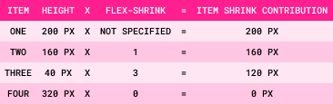
When the flex-shrink value is not specified for an item, it defaults to 1.
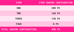
Step 4: Total Shrink Contribution = Sum of All Item Shrink Contributions
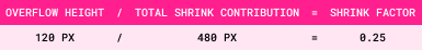
Step 5: Shrink Factor = Overflow Amount/Total Shrink Contribution
Step 6: Shrink Amount = Item Shrink Contribution x Shrink Factor
Step 7: Final Size = Item Size - Shrink Amount
Visual Examples
Here is a visual representation of the written example:
The container and items without flex-shrink values:
Item One
original height: 200px
Item Two
original height: 160px
Item Three
original height: 40px
Item Four
original height: 320px
The container and items with flex-shrink values:
Item One
flex-shrink: 1
original height: 200px
final height: 150px
Item Two
flex-shrink: 1
original height: 160px
final height: 120px
Item Three
flex-shrink: 3
original height: 40px final height: 10px
Item Four
flex-shrink: 0
original height: 320px
final height: 320px
The following three examples demonstrate the flex-shrink property with flex items that are all the same size. The following information will be valid for the first 3 examples:
- The flex container has a static width of 320px.
- All 3 flex items have a set width of 160px with no padding or margins, which means the minimum amount of space they will take up is 480px (160px x 3 = 480px).
- This means the items will be wider than the container, making the overflow width 160px (480px - 320px = 160px).
Example 1: The flex-shrink value is 0 for all items.
A
flex-shrink: 0
width: 160px
B
flex-shrink: 0
width: 160px
C
flex-shrink: 0
width: 160px
Since the value is 0 for all items, they will not shrink. This means the items will remain at their minimum width of 160px which will cause them to overflow the container by 160px (160px + 160px + 160px = 480px - 320px = 160px) since wrapping is not set.
Example 2: The flex-shrink value is set to 0 for item A, and 1 (default value) for items B and C.
A
flex-shrink: 0
width: 160px
B
flex-shrink: 1
width: 80px
C
flex-shrink: 1
width: 80px
Since the value is 0 for item A, it will not shrink. Items B and C have a value of 1, so they will shrink to fit the space of the container. In this case, both B and C would shrink by 1/2 of the overflow width, which is 80px (160px / 2 = 80px). This means item B and C will shrink to 80px (160px - 80px = 80px).
Example 3: The flex-shrink value is set to 1 (default value) for item A, 2 for item B, and 3 for item C.
A
flex-shrink: 1
width: 133.33px
B
flex-shrink: 2
width: 106.66px
C
flex-shrink: 3
width: 80px
In this example, all 3 items will shrink to fit the container by different amounts. Item A has a value of 1, item B has a value of 2, and item C has a value of 3. This means item A will shrink by 1/6 of the overflow width, item B will shrink by 2/6 of the overflow width, and item C will shrink by 3/6 of the overflow width. The overflow width needs to be divided by 6 parts in this case (1 + 2 + 3 = 6). This gives us a unit number of 26.66px (160px / 6 = 26.66px). This means item A will shrink to 133.33px (160px - 26.66px = 133.33px), item B will shrink to 106.66px (160px - 53.33px = 106.66px), and item C will shrink to 80px (160px - 80px = 80px).
The flex-basis property controls the initial size of the flex item before any growth or shrinkage occurs. The default value is auto which means the initial size of the flex item is determined by the width (if the flex-direction is row based) or height (if the flex-direction is column based) set for the item. The value can be a length, a percentage, or an initial or inherit value. If a length or percentage is set for the flex-basis property, it will override the width or height set for the item UNLESS it is min-width, max-width, min-height, or max-height. When a percentage is used as the value, it is relative to the width of the flex container.
The following information will be valid for this example:
- The flex container has a static width of 320px.
- Items A and B have a set width of 160px with no padding or margins.
- Item C has a set max-width and min-width of 120px with no padding or margins.
Example 1: The flex-basis value is set to 120px for item A, 25% for item B, and 100px for item C.
A
flex-basis: 120px
set width: 160px
width: 120px
B
flex-basis: 25%
set-width: 160px
width: 80px
C
flex-basis: 100px
set max/min-width: 120px
width: 120px
Flex Shorthand
The flex property is a shorthand property for the flex-grow, flex-shrink, and flex-basis properties. It always affects all three properties, and can be specified using one, two, or three values.
Flex: One Syntax Value
When a single value is used for the flex property, it must be one of the following:
- Number:
When a number is the only value given, it will read as the flex-grow value. When this is done, the flex-shrink value is automatically set to 1 and the flex-basis value is automatically set to 0. This means that the flex-basis value will be dependent on the size created by the flex-grow value. It also means that flex items will grow or shrink in the container.
- Width (for rows) or Height (for columns):
When a width or height is the only value given, it will read as the flex-basis value. When this is done, the flex-grow value is automatically set to 1 and the flex-shrink value is automatically set to 1. This means that flex items will grow or shrink in the container.
- Keywords:
There are 3 keywords that can be used for the flex property:
- auto:
When auto is the only value given, the items are sized according to their width and height properties, and the flex-grow and flex-shrink values are set to 1. This means that flex items will grow or shrink in the container.
- none:
When none is the only value given, the items are sized according to their width and height properties, and the flex-grow and flex-shrink values are set to 0. This means that flex items will not grow or shrink in the container.
- initial:
When initial is the only value given, the items are sized according to their width and height properties, the flex-grow property is automatically set to 0, and the flex-shrink property is automatically set to 1. This means that flex items will shrink to fit the container when necessary, but they will not grow to fill the additional space in the container.
Flex: Two Syntax Values
When two values are used for the flex property, the first value must be a number to represent the flex-grow value.
The second value must be one of the following:
- Number:
When a number is given as the second value, it will read as the flex-shrink value. The flex-basis value is automatically set to 0% (auto).
- A Valid Flex-Basis Value: When a flex-basis value is given as the second value, the flex-shrink value is automatically set to its default value of 1.
Flex: Three Syntax Values
When three values are used for the flex property, the first value is the flex-grow value, the second value is the flex-shrink value, and the third value is the flex-basis value.